 |
| A green, white, box |
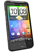
Combined with a very light weight, high quality plastics on the rear (that have an almost matte feeling) with an embossed HTC logo and the phone feels lovely to behold. Now that may seem a little odd, anal even, but when you consider how much you actually use a phone and how often it is in your hands, it doesn't seem so daft to point out after all. It really gives the phone a premium feel, a sense of purpose and this is something that Apple have managed for years with the eponymous iPhone. I'd argue this is the first phone not from Apple to really match it on build quality (and funky packaging).
 |
| A OneX, Lens Cap Not Included |
So, it is a quality product that is leaps and bounds forward over previous HTC devices from a design standpoint. What about what it's like to live with. After all, it may be one of the (if not the?) most powerful phones on the market, but if that was reason alone to buy one we'd all be buying Blackberry Curves or Nokia Lumia 900's. But we're not. Come back later this week for more and in the mean time, check out the quick video below when I opened it and turned it on for the first time. I've also made a G+ picture album and read the image captions for more impressions (for instance, transferring old contacts to new phone using Bluetooth is pretty swish and every so useful).
A follow up post to A New Phone: Taking The Plunge


